Care for Cancer Survivors
Santé is a service to support cancer survivors post-treatment , helping its users set priorities for their recovery, and reduce recurrence. This is done through an app and a food delivery service.
Problem
Through user research we identified a gap in care for cancer survivor, where patients go from constant check-ins and progress tracking to months between check-ins. Meanwhile, they’re still feeling lingering side effects and may want to change their lifestyles and prevent recurrence.
Through user research we identified a gap in care for cancer survivor, where patients go from constant check-ins and progress tracking to months between check-ins. Meanwhile, they’re still feeling lingering side effects and may want to change their lifestyles and prevent recurrence.
Role
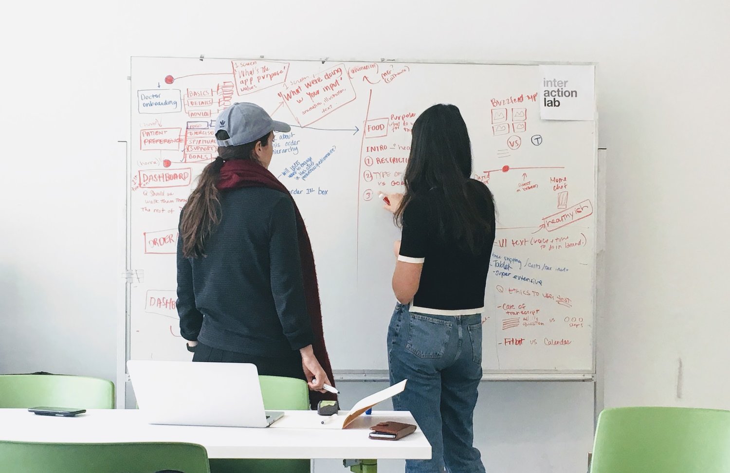
Myself and Interaction Designer Amelia Koster worked on this project in Spring 2018. We collaborated on the primary and secondary research, ideation, wireframing, prototyping, and testing. Amelia was in charge of illustrations and visual assets, while I focused on the UI, motion design, and video.
Myself and Interaction Designer Amelia Koster worked on this project in Spring 2018. We collaborated on the primary and secondary research, ideation, wireframing, prototyping, and testing. Amelia was in charge of illustrations and visual assets, while I focused on the UI, motion design, and video.
Goal
Engaging the day to day of survivors after life changing event, balancing comfort and progress.
Engaging the day to day of survivors after life changing event, balancing comfort and progress.
Considerations and Principles
Fluctuating mental and physical states of survivors: Have a contextual approach (day to day)
Celebrating the victory while understanding the seriousness: Dynamic yet rational visual design
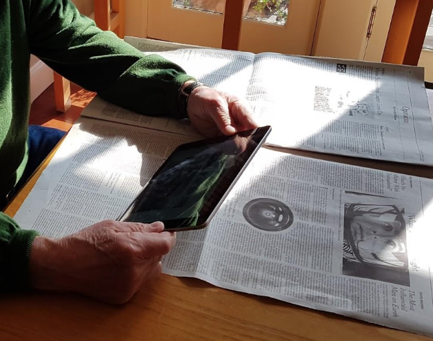
50-70 year old audience: Consider accessibility and types of devices (our research found tablets are the most trusted and enjoyable devices for this age group).
Fluctuating mental and physical states of survivors: Have a contextual approach (day to day)
Celebrating the victory while understanding the seriousness: Dynamic yet rational visual design
50-70 year old audience: Consider accessibility and types of devices (our research found tablets are the most trusted and enjoyable devices for this age group).

Process
We let primary and secondary research guide our design. We met with dietitians specialized in remission, as well as people working with survivors at BC Cancer.
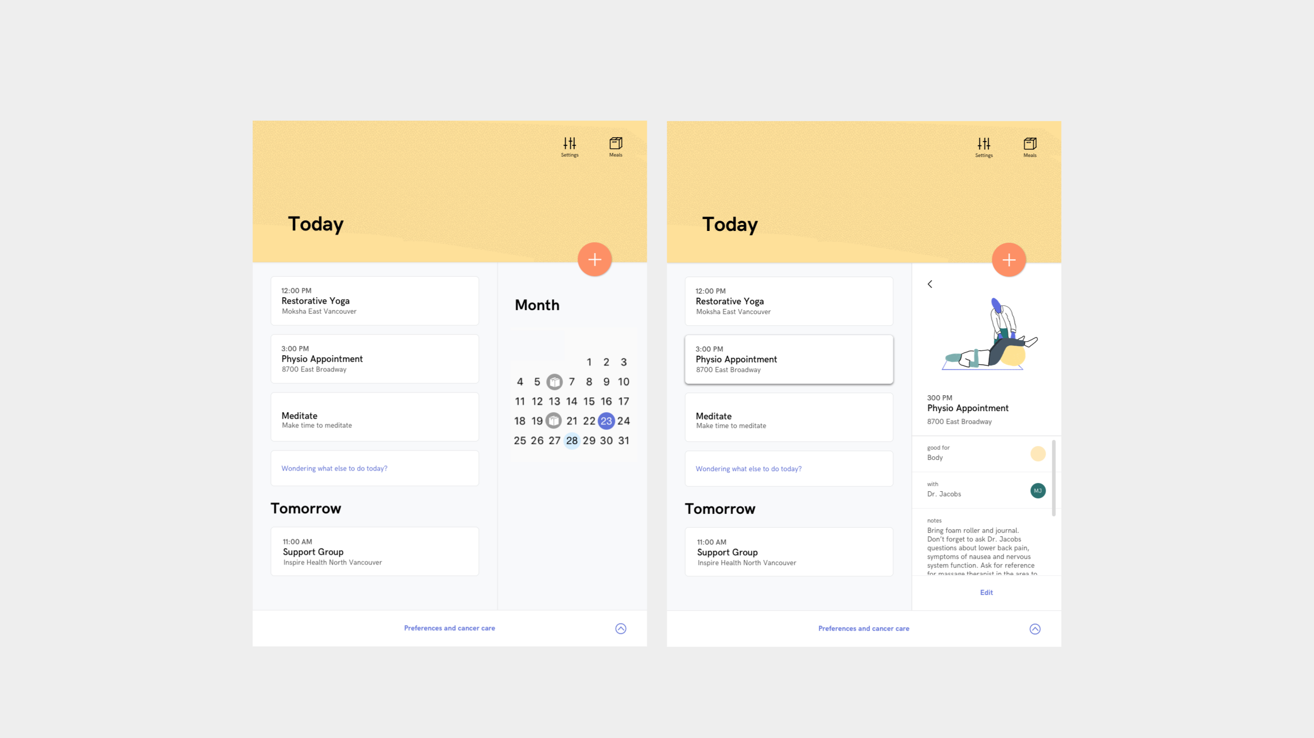
Calendar as main UI
A Center for Human Technology study shows that apps that manage time efficiently like calendars make people happiest, whereas social networks tend to leave user feeling more unhappy after use.
The calendar format would also connect with out “contexutal (day to day)” principle. It would be a great way to keep track of progress without gamifying, and connect to the food delivery.
We let primary and secondary research guide our design. We met with dietitians specialized in remission, as well as people working with survivors at BC Cancer.
Calendar as main UI
A Center for Human Technology study shows that apps that manage time efficiently like calendars make people happiest, whereas social networks tend to leave user feeling more unhappy after use.
The calendar format would also connect with out “contexutal (day to day)” principle. It would be a great way to keep track of progress without gamifying, and connect to the food delivery.
Onboarding Questionnaire
To make the tool relevant and engaging to the survivor, there is a questionnaire going over the type of cancer and treatment as well as food, exercise, spirituality, and support preferences.
Users can always go back to the questionnaire to finish it later.

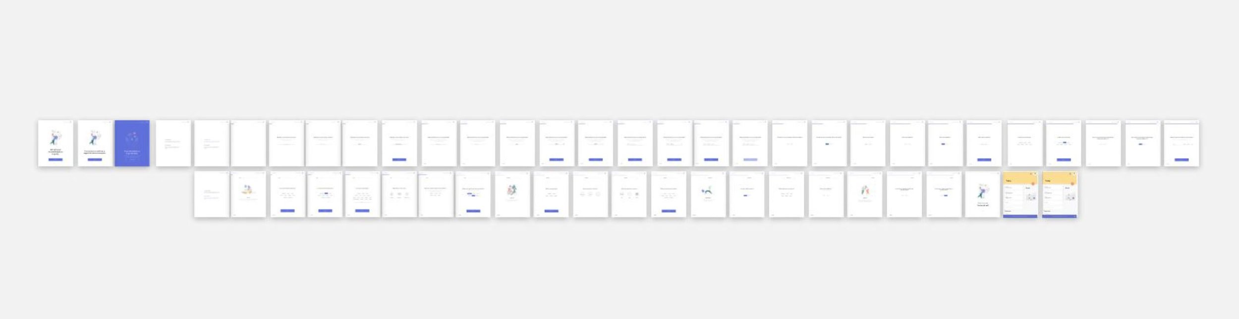
Testing the UI and box design
We made several prototypes and iterations of the box and the app, based on user testing (proxy and cancer survivors).
Some insights: For the questionnaire, people needed to know why a certain question was asked as well as where the information was going (applied above).
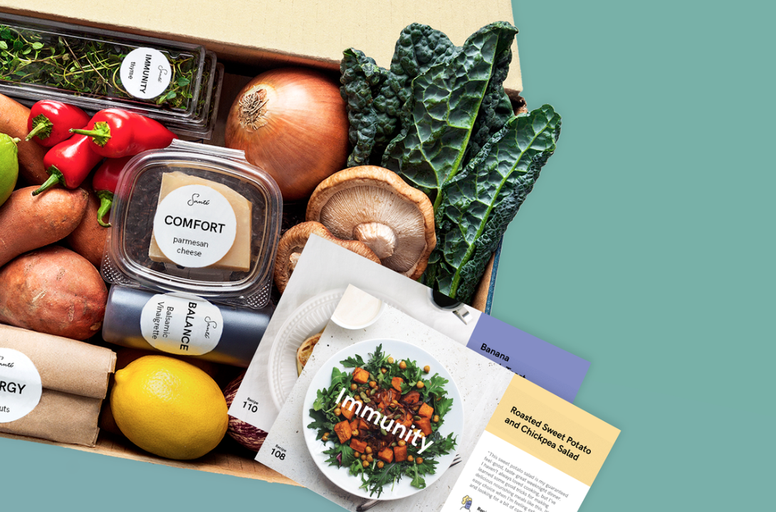
For the box, putting forward the value, instead of the name of the food itself made it more personal and delightful. Menus needed to consider varying energy levels (through pre-cut vegetables, for instance). It also needed to be cohesive with the branding and functionality of the app.
We made several prototypes and iterations of the box and the app, based on user testing (proxy and cancer survivors).
Some insights: For the questionnaire, people needed to know why a certain question was asked as well as where the information was going (applied above).
For the box, putting forward the value, instead of the name of the food itself made it more personal and delightful. Menus needed to consider varying energy levels (through pre-cut vegetables, for instance). It also needed to be cohesive with the branding and functionality of the app.
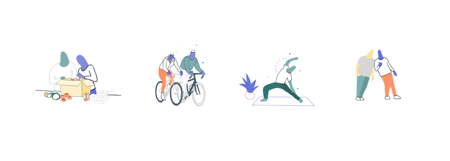
Making UI more human
Amelia developped illustrations while I applied motion onto the products to make them reassuring and non-clinical (guided by our “dynamic, yet rational” principle). We also created a colour palette and a voice and tone that would respond to our principles.
Amelia developped illustrations while I applied motion onto the products to make them reassuring and non-clinical (guided by our “dynamic, yet rational” principle). We also created a colour palette and a voice and tone that would respond to our principles.